I had a recent client that I will use as an example. He is starting a food safety consulting business, needed a logo, but had no visual ideas. The name of his company didn't have an obvious visual cue, so I just had to experiment. After a few revisions we were able to narrow things down to a design we both liked.
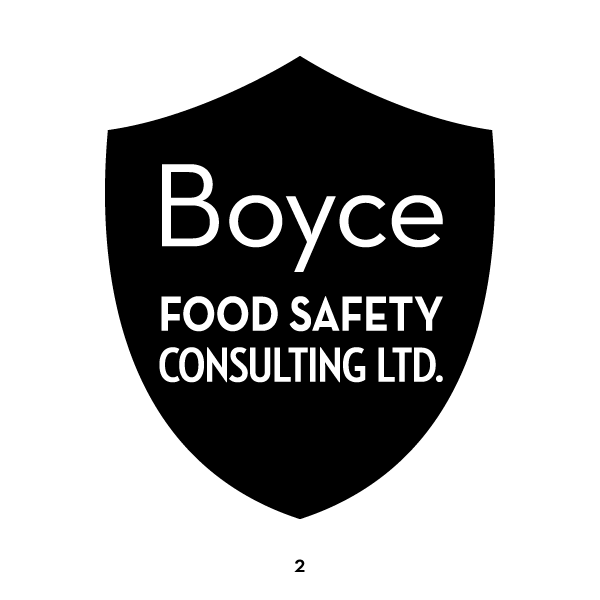
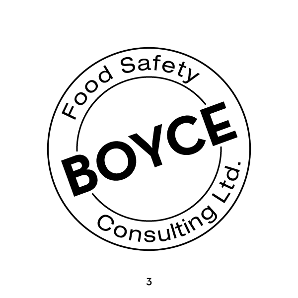
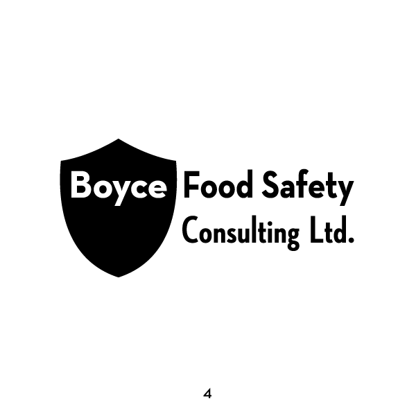
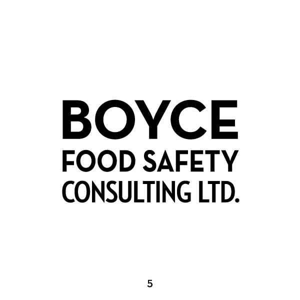
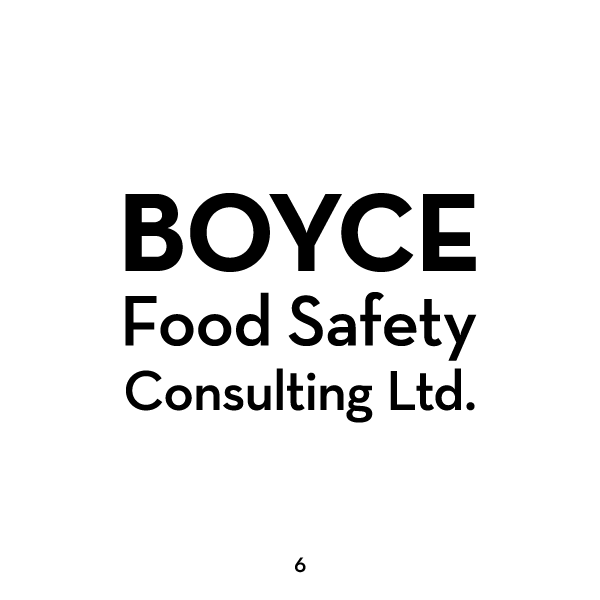
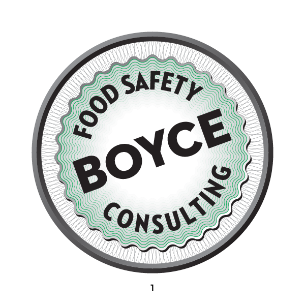
The first thing is to have an interview on the phone or in person, where I get an idea of your business, mission, and projected image. Let me know where and how it would be used in print and on screen. He needs business cards primarily, then letterhead, powerpoint icons, and a web banner. I start in black and white just to get a concept, as a good logo should be recognizable without color, which can be added later. He had no idea what look he was after, but invited me to experiment with fonts and arrangement. Here is the first batch.
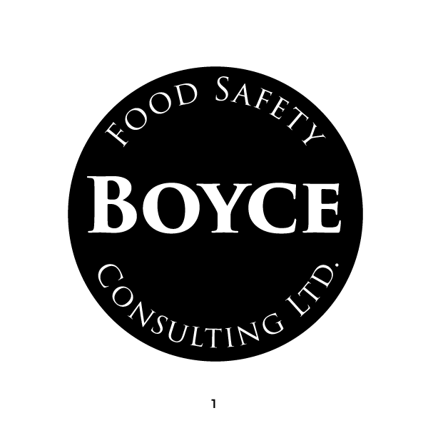
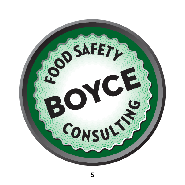
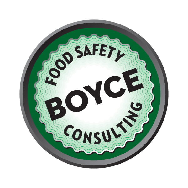
After emailing him a PDF of the above designs, he liked the concept of the round seal of approval in #3. After seeing these, he agreed that "LTD" didn't need to be part of the logo. So I used the round seal concept in a second set of trials. We agreed that this might be a good time to try a color. So representing approvals, a positive green for "go."
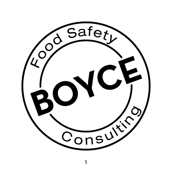
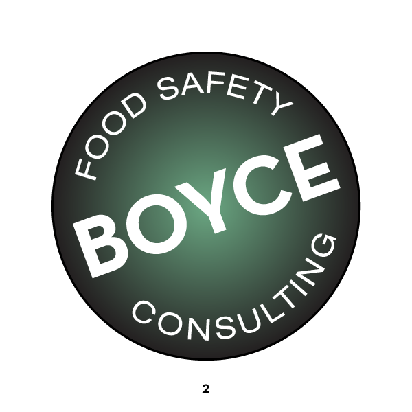
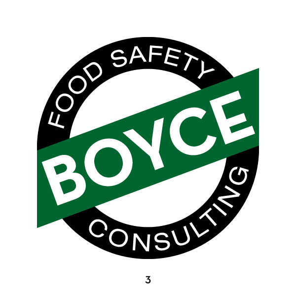
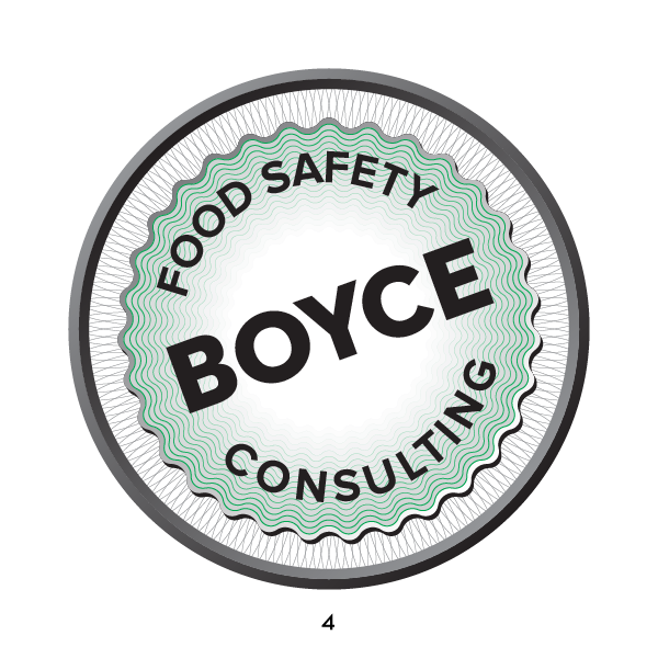
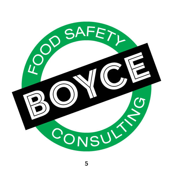
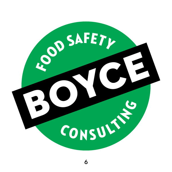
He immediately liked #4, which he recognised as a certificate of approval, which fits his job description and company mission. He also felt that on a business card, where the logo is seen right next to his company name, this would be too much redundant text. This led to the third set, using his idea of a checkmark for an alternate wordless logo.
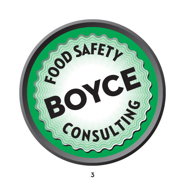
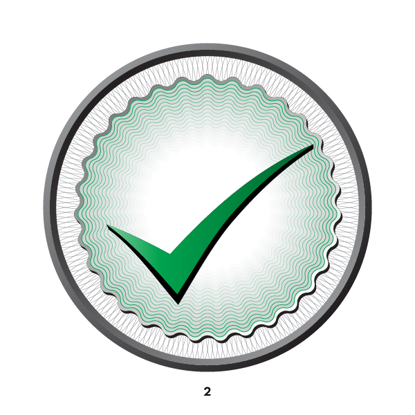
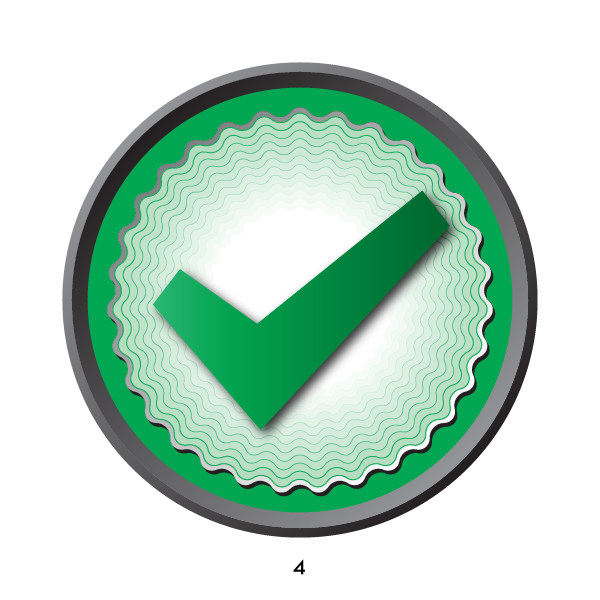
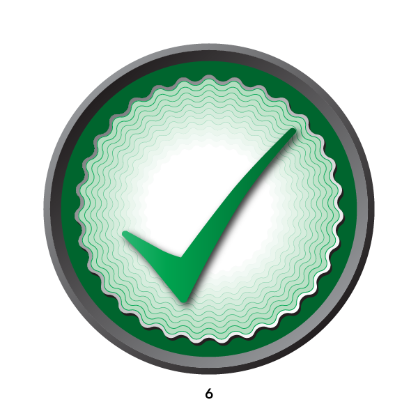
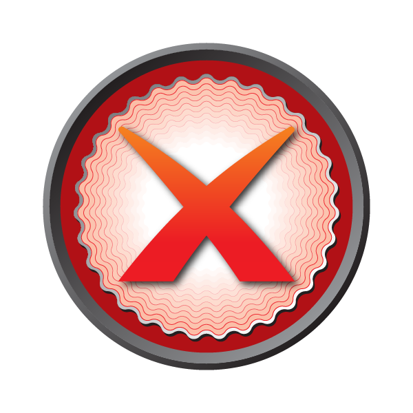
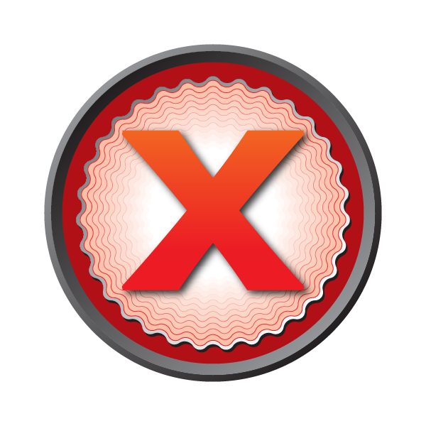
He approved #3 as the logo! He wasn't sure which checkmark he liked the best, but also would need a red "X" for his powerpoints. So I designed a pair of each to help decide. I also started certificate-looking elements for the business card and letterhead, seen in the last example.


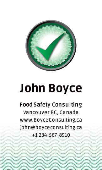
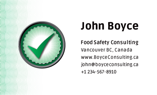
Here are the final business cards. We tried a few font and size variations to come up with these. He couldn't decide if he wanted vertical or horizontal, so he ordered a box of each.
I never expect to hit a hole-in-one at the first try. It's always a process of distilling to arrive at the right logo and look. I'm proud of what we accomplished in a short time.